Lecture 0
- Introduction
- Web Programming
- HTML (Hypertext Markup Language)
- CSS (Cascading Style Sheets)
- Responsive Design
- Bootstrap
- Sass (Syntactically Awesome Style Sheets)
Introduction
In this course, we’re picking up where CS50 left off and diving into the design and creation of web applications. We’ll build our web-design skills by working on a number of projects throughout the course, including an open-ended final project where you’ll have the chance to create a website of your own!
In this course, you’ll need a text editor where you can write code locally on your computer. Some popular ones include Visual Studios Code, Sublime Text, Atom, and Vim, but there are many more to choose from!
Web Programming
Course Topics: We’ll go into more detail later, but here’s a brief overview of what we’ll be working on during this course:
- HTML and CSS (a markup language used to outline a webpage, and a procedure for making our sites more visually appealing)
- Git (used for version control and collaboration)
- Python (a widely-used programming language we’ll use to make our sites more dynamic)
- Django (a popular web framework we’ll use for the backend of our sites)
- SQL, Models, and Migrations (a language used for storing and retrieving data, and Django-specific methods that make it easier to interact with SQL databases)
- JavaScript (a programming language used to make websites faster and more interactive)
- User Interfaces (methods used to make a website as easy to use as possible)
- Testing, CI, CD (learning about different methods used to make sure updates to web pages proceed smoothly)
- Scalability and Security (making sure our websites can be accessed by many users at once, and that they are safe from malicious intent)
HTML (Hypertext Markup Language)
- HTML is a markup language that defines the structure of a web page. It is interpreted by your web browser (Safari, Google Chrome, Firefox, etc.) in order to display content on your screen.
- Let’s get started by writing a simple HTML file!
<!DOCTYPE html>
<html lang="en">
<head>
<title>Hello!</title>
</head>
<body>
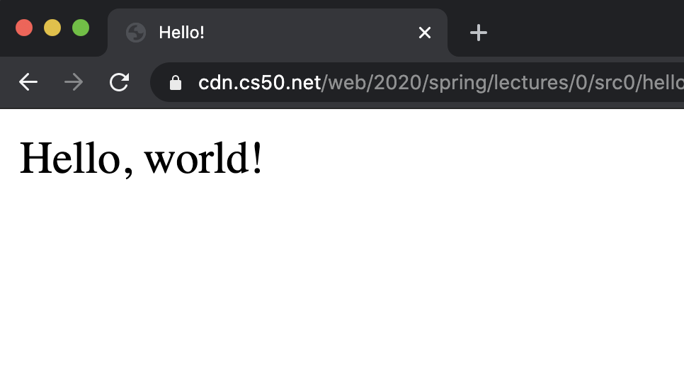
Hello, world!
</body>
<html>
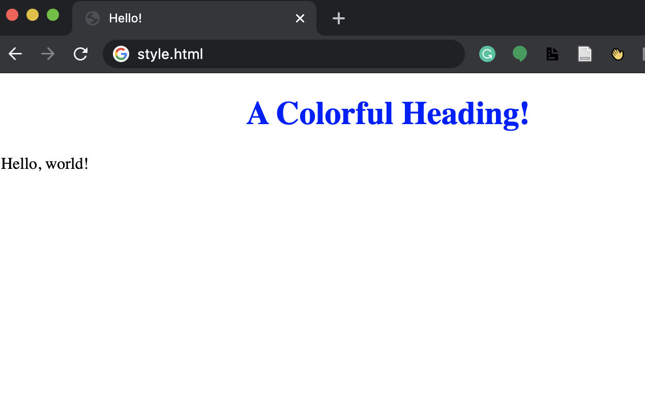
- When we open up this file in our browser, we get:
- Now, let’s take some time to talk about the file we just wrote, which seems to be pretty complicated for such a simple page.
- In the first line, we are declaring (to the web browser) that we are writing the document in the latest version of HTML: HTML5.
- After that, the page consists of nested HTML elements (such as html and body), each with an opening and closing tag marked with either
<element>for an opening and</element>for a closing. - Notice how each of the inner elements is indented just a bit further than the last. While this is not necessarily required by the browser, it will be very helpful to keep this up in your own code.
- HTML elements can include attributes, which give the browser extra information about the element. For example, when we include
lang="en"in our initial tag, we are telling the browser that we are using English as our primary language. - Inside the HTML element, we typically want to include both a
headand abodytag. The head element will include information about your page that is not necessarily displayed, and the body element will contain what is actually visible to users who visit the site. - Within the head, we have included a
titlefor our webpage, which you’ll notice is displayed in the tab at the top of our web browser. - Finally, we’ve included the text “Hello, world!” in the body, which is the visible part of our page.
Document Object Model (DOM)
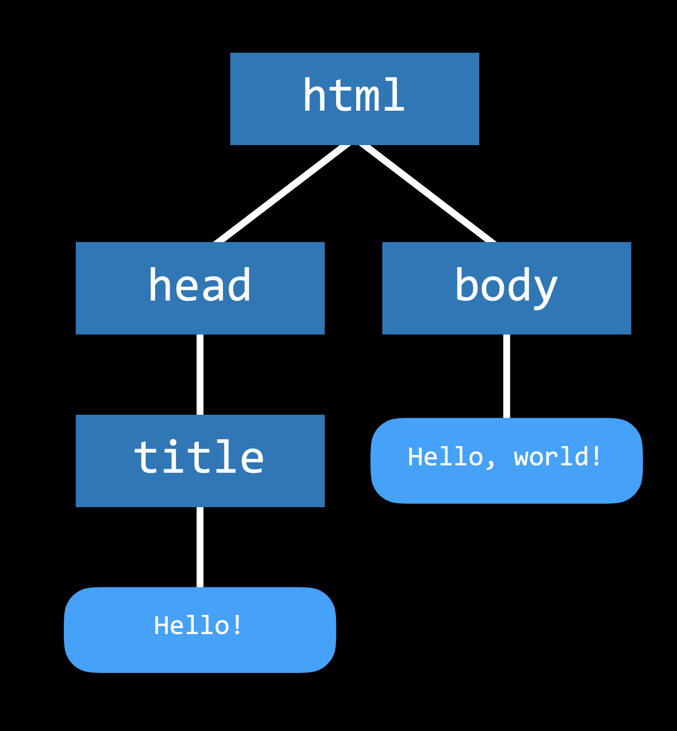
- The DOM is a convenient way of visualizing the way HTML elements relate to each other using a tree-like structure. Above is an example of the DOM layout for the page we just wrote.
More HTML Elements
- There are many HTML elements you may want to use to customize your page, including headings, lists, and bolded sections. In this next example, we’ll see a few of of these in action.
- One more thing to note:
<!-- -->gives us a comment in HTML, so we’ll use that below to explain some of the elements.
<!DOCTYPE html>
<html lang="en">
    <head>
        <title>HTML Elements</title>
    </head>
    <body>
        <!-- We can create headings using h1 through h6 as tags. -->
        <h1>A Large Heading</h1>
        <h2>A Smaller Heading</h2>
        <h6>The Smallest Heading</h6>

        <!-- The strong and i tags give us bold and italics respectively. -->
        A <strong>bold</strong> word and an <i>italicized</i> word!

        <!-- We can link to another page (such as cs50's page) using a. -->
        View the <a href="https://cs50.harvard.edu/">CS50 Website</a>!

        <!-- We used ul for an unordered list and ol for an ordered one. both ordered and unordered lists contain li, or list items. -->
        An unordered list:
        <ul>
            <li>foo</li>
            <li>bar</li>
            <li>baz</li>
        </ul>
        An ordered list:
        <ol>
            <li>foo</li>
            <li>bar</li>
            <li>baz</li>
        </ol>

        <!-- Images require a src attribute, which can be either the path to a file on your computer or the link to an image online. It also includes an alt attribute, which gives a description in case the image can't be loaded. -->
        An image:
        <img src="../../images/duck.jpeg" alt="Rubber Duck Picture">
        <!-- We can also see above that for some elements that don't contain other ones, closing tags are not necessary. -->

        <!-- Here, we use a br tag to add white space to the page. -->
        <br/> <br/>

        <!-- A few different tags are necessary to create a table. -->
        <table>
            <thead>
                <th>Ocean</th>
                <th>Average Depth</th>
                <th>Maximum Depth</th>
            </thead>
            <tbody>
                <tr>
                    <td>Pacific</td>
                    <td>4280 m</td>
                    <td>10911 m</td>
                </tr>
                <tr>
                    <td>Atlantic</td>
                    <td>3646 m</td>
                    <td>8486 m</td>
                </tr>
            </tbody>
        </table>
    </body>
<html>
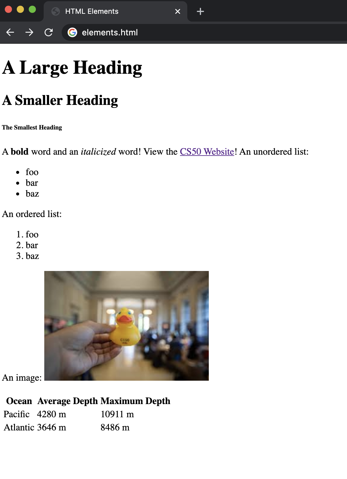
This page, when rendered, looks something like this:
- In case you’re worried about it, know that you’ll never have to memorize these elements. It’s very easy to simply search something like “image in HTML” to find the
imgtag. One resource that’s especially helpful for learning about these elements is W3 Schools.
Forms
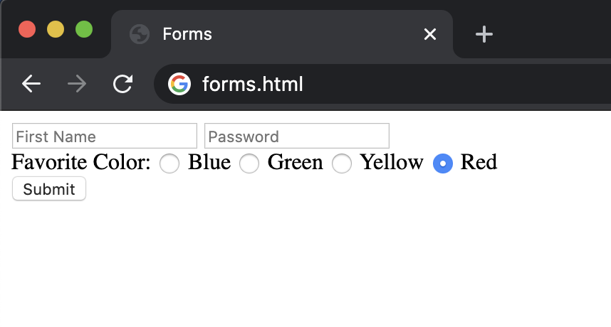
- Another set of elements that is really important when creating a website is how to collect information from users. You can allow users to enter information using an HTML form, which can contain several different types of input. Later in the course, we’ll learn about how to handle information once a form has been submitted.
- Just as with other HTML elements, there’s no need to memorize these, and W3 Schools is a great resource for learning about them!
<!DOCTYPE html>
<html lang="en">
<head>
    <title>Forms</title>
</head>
<body>
    <form>
        <input type="text" placeholder="First Name" name="first">
        <input type="password" placeholder="Password" name="password">
        <div>
            Favorite Color:
            <input name="color" type="radio" value="blue"> Blue
            <input name="color" type="radio" value="green"> Green
            <input name="color" type="radio" value="yellow"> Yellow
            <input name="color" type="radio" value="red"> Red

        </div>
        <input type="submit">
    </form>
</body>
</html>
CSS (Cascading Style Sheets)
- CSS is used to customize the appearance of a website.
- While we’re just getting, started, we can add a style attribute to any HTML element in order to apply some CSS to it.
- We change style by altering the CSS properties of an element, writing something like
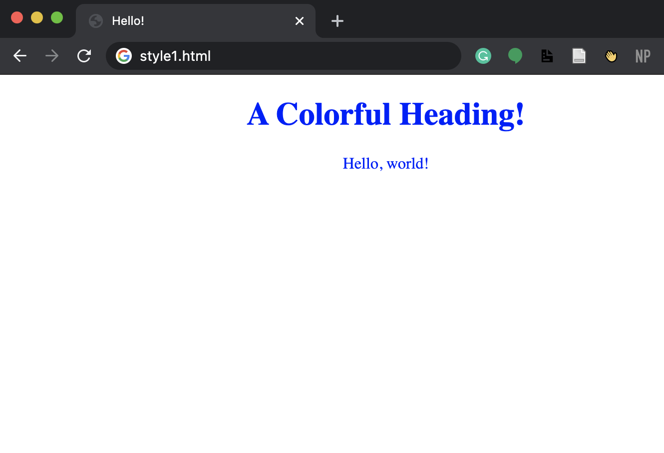
color: blueortext-align: center - In this example below, we make a slight change to our very first file to give it a colorful heading:
<!DOCTYPE html>
<html lang="en">
    <head>
        <title>Hello!</title>
    </head>
    <body>
        <h1 style="color: blue; text-align: center;">A Colorful Heading!</h1>
        Hello, world!
    </body>
<html>
- If we style an outer element, all of the inner elements automatically take on that style. We can see this if we move the styling we just applied from the header tag to the body tag:
<!DOCTYPE html>
<html lang="en">
    <head>
        <title>Hello!</title>
    </head>
    <body style="color: blue; text-align: center;">
        <h1 >A Colorful Heading!</h1>
        Hello, world!
    </body>
<html>
- While we can style our web page as we’ve done above, to achieve better design, we should be able to move our styling away from the individual lines.
- One way of doing this is to add your styling between
<style>tags in thehead. Inside these tags, we write which types of elements we want to be style, and the styling we wish to apply to them. For example:
<html lang="en"> <!DOCTYPE html> <head> <title>Hello!</title> <style> h1 { color: blue; text-align: center; } </style> </head> <body> <h1 >A Colorful Heading!</h1> Hello, world! </body> </html>- Another way is to include in a
<link>element in yourheadwith a link to a styles.css file that contains some styling. This means the HTML file would look like:
  <html lang="en">
  <!DOCTYPE html>
  <head>
      <title>Hello!</title>
      <link rel="stylesheet" href="styles.css">
  </head>
  <body>
      <h1 >A Colorful Heading!</h1>
      Hello, world!
  </body>
  </html>
And our file called
styles.csswould look like:h1 { color: blue; text-align: center; } - One way of doing this is to add your styling between
- There are far too many CSS properties to go over here, but just like HTML elements, it’s typically easy to Google something along the lines of “change font to blue CSS” to get the result. Some of the most common ones though are:
-
color: the color of text -
text-align: where elements are placed on the page -
background-color: can be set to any color -
width: in pixels or percent of a page -
height: in pixels or percent of a page -
padding: how much space should be left inside an element -
margin: how much space should be left outside an element -
font-family: type of font for text on page -
font-size: in pixels -
border: size type (solid, dashed, etc) color
-
- Let’s use some of what we just learned to improve upon our oceans table from above. Here’s some HTML to start us off:
<!DOCTYPE html>
<html lang="en">
    <head>
        <title>Nicer Table</title>
    </head>
    <body>
        <table>
            <thead>
                <th>Ocean</th>
                <th>Average Depth</th>
                <th>Maximum Depth</th>
            </thead>
            <tbody>
                <tr>
                    <td>Pacific</td>
                    <td>4280 m</td>
                    <td>10911 m</td>
                </tr>
                <tr>
                    <td>Atlantic</td>
                    <td>3646 m</td>
                    <td>8486 m</td>
                </tr>
            </tbody>
        </table>
    </body>
<html>
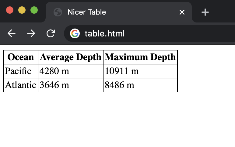
- The above looks a lot like what we had before, but now, either by including a
styletag or alinkto a stylesheet in the head element, we add the following css:
table {
    border: 1px solid black;
    border-collapse: collapse;
}

td {
    border: 1px solid black;
    padding: 2px;
}

th {
    border: 1px solid black;
    padding: 2px;
}
Which leaves us with this nicer-looking table:
- You may already be thinking that there’s some needless repetition in our CSS at the moment, as
tdandthhave the same styling. We can (and should) condense this down to the following code, using a comma to show the styling should apply to more than one element type.
table {
    border: 1px solid black;
    border-collapse: collapse;
}

td, th {
    border: 1px solid black;
    padding: 2px;
}
- This is a good introduction into what are known as CSS selectors. There are many ways to determine which HTML elements you are styling, some of which we’ll mention here:
- element type: this is what we’ve been doing so far: styling all elements of the same type.
-
id: Another option is to give our HTML elements an id like so:
<h1 id="first-header">Hello!</h1>and then applying styling using#first-header{...}using the hashtag to show that we’re searching by id. Importantly, no two elements can have the same id, and no element can have more than one id. -
class: This is similar to id, but a class can be shared by more than one element, and a single element can have more than one class. We add classes to an HTML element like this:
<h1 class="page-text muted">Hello!</h1>(note that we just added two classes to the element:page-textandmuted). We then style based on class using a period instead of a hashtag:.muted {...}
- Now, we also have to deal with the problem of potentially conflicting CSS. What happens when a header should be red based on its class but blue based on its id? CSS has a specificity order that goes:
- In-line styling
- id
- class
- element type
- In addition to the comma for multiple selectors, there are several other ways to specify which elements you would like to style. This table from lecture provides a few, and we’ll go through a few examples below:
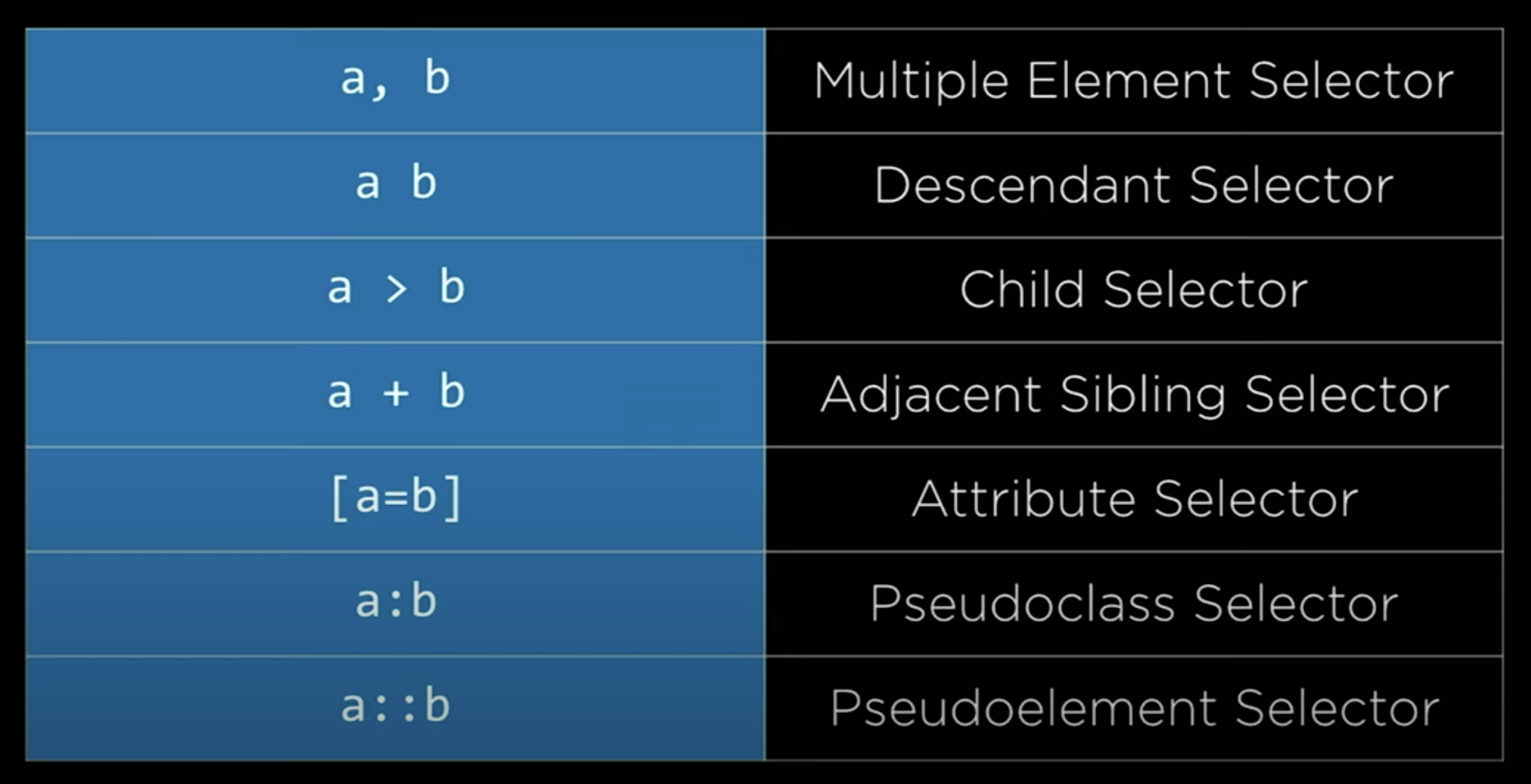
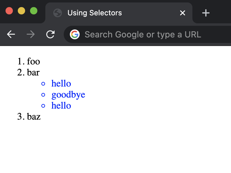
Descendant Selector: Here, we use the descendant selector to only apply styling to list items found within an unordered list:
<!DOCTYPE html>
<html lang="en">
    <head>
        <title>Using Selectors</title>
        <style>
            ul li {
                color: blue;
            }
        </style>
    </head>
    <body>
        <ol>
            <li>foo</li>
            <li> bar
                <ul>
                    <li>hello</li>
                    <li>goodbye</li>
                    <li>hello</li>
                </ul>
            </li>
            <li>baz</li>
        </ol>

    </body>
<html>
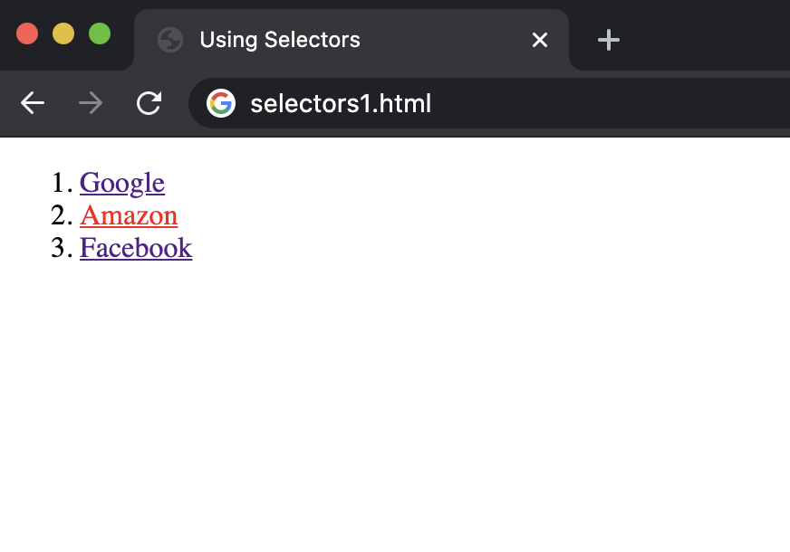
Attributes as Selectors: We can also narrow down our selection based on the attributes we assign to HTML elements using brackets. For example, in the following list of links, we choose to only make the link to Amazon red:
<!DOCTYPE html>
<html lang="en">
    <head>
        <title>Using Selectors</title>
        <style>
            a[href="https://www.amazon.com/"] {
                color: red;
            }
        </style>
    </head>
    <body>
        <ol>
            <li><a href="https://www.google.com/">Google</a></li>
            <li><a href="https://www.amazon.com/">Amazon</a> </li>
            <li><a href="https://www.facebook.com/">Facebook</a></li>
        </ol>

    </body>
<html>
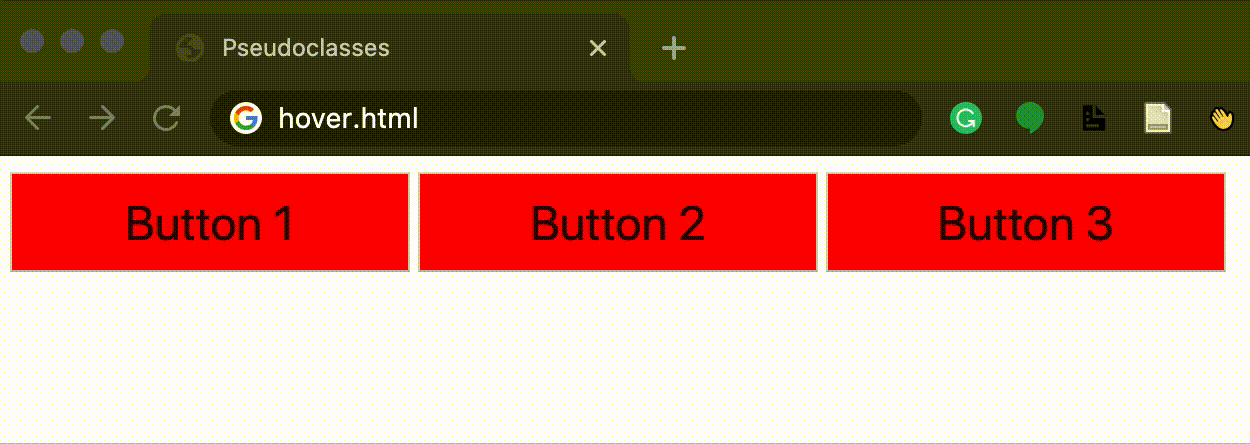
- Not only can we use CSS to change what an element looks like permanently, but also what it looks like under certain conditions. For example, what if we wanted a button to change color when we hover over it? We can acheive this using a CSS pseudoclass, which provides additional styling during special circumstances. We write this by adding a colon after our selector, and then adding the circumstance after that colon.
- In the case of the button, we would add
:hoverto the button selector to specify the design only when hovering:
<!DOCTYPE html>
<html lang="en">
    <head>
        <title>Pseudoclasses</title>
        <style>
            button {
                background-color: red;
                width: 200px;
                height: 50px;
                font-size: 24px;
            }

            button:hover {
                background-color: green;
            }
        </style>
    </head>
    <body>
        <button>Button 1</button>
        <button>Button 2</button>
        <button>Button 3</button>

    </body>
<html>
Responsive Design
- Today, many people view websites on devices other than computers, such as smartphones and tablets. It’s important to make sure your website is readable to people on all devices.
- One way we can achieve this is through knowledge of the viewport. The viewport is the part of the screen that is actually visible to the user at any given time. By default, many webpages assume that the viewport is the same on any device, which is what leads to many sites (especially older ones) being difficult to interact with on mobile devices.
- One simple way to improve the appearance of a site on a mobile device is to add the following line in the head of our HTML files. This line tells the mobile device to use a viewport that is the same width as that of the device you’re using rather than a much larger one.
<meta name="viewport" content="width=device-width, initial-scale=1.0">
- Another way we can deal with different devices is through media queries. Media queries are ways of changing the style of a page based on how the page is being viewed.
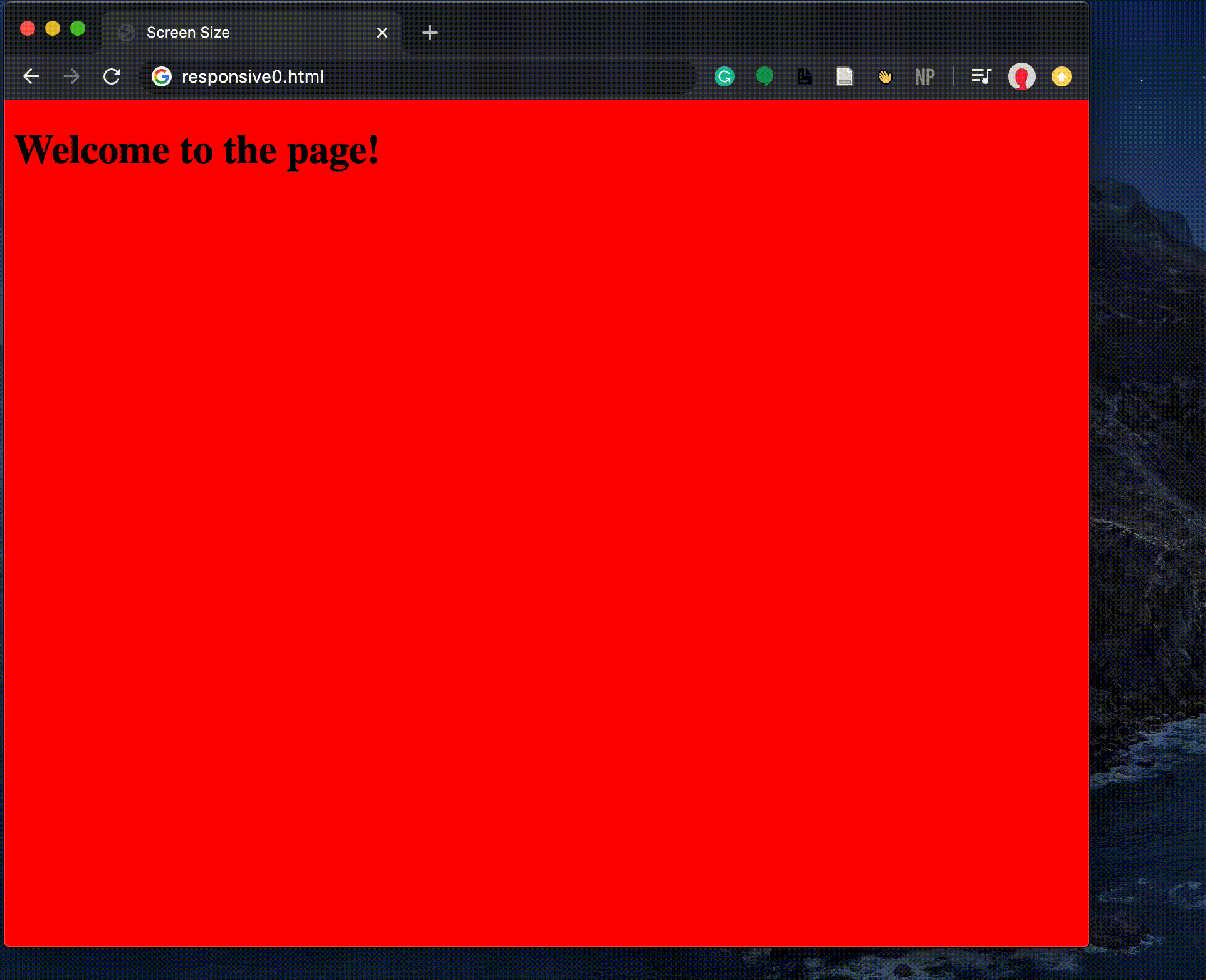
- For an example of a media query, let’s try to simply change the color of the screen when it shrinks down to a certain size. We signal a media query by typing
@mediafollowed by the type of query in parentheses:
<!DOCTYPE html>
<html lang="en">
    <head>
        <title>Screen Size</title>
        <style>
            @media (min-width: 600px) {
                body {
                    background-color: red;
                }
            }

            @media (max-width: 599px) {
                body {
                    background-color: blue;
                }
            }
        </style>
    </head>
    <body>
        <h1>Welcome to the page!</h1>
    </body>
</html>
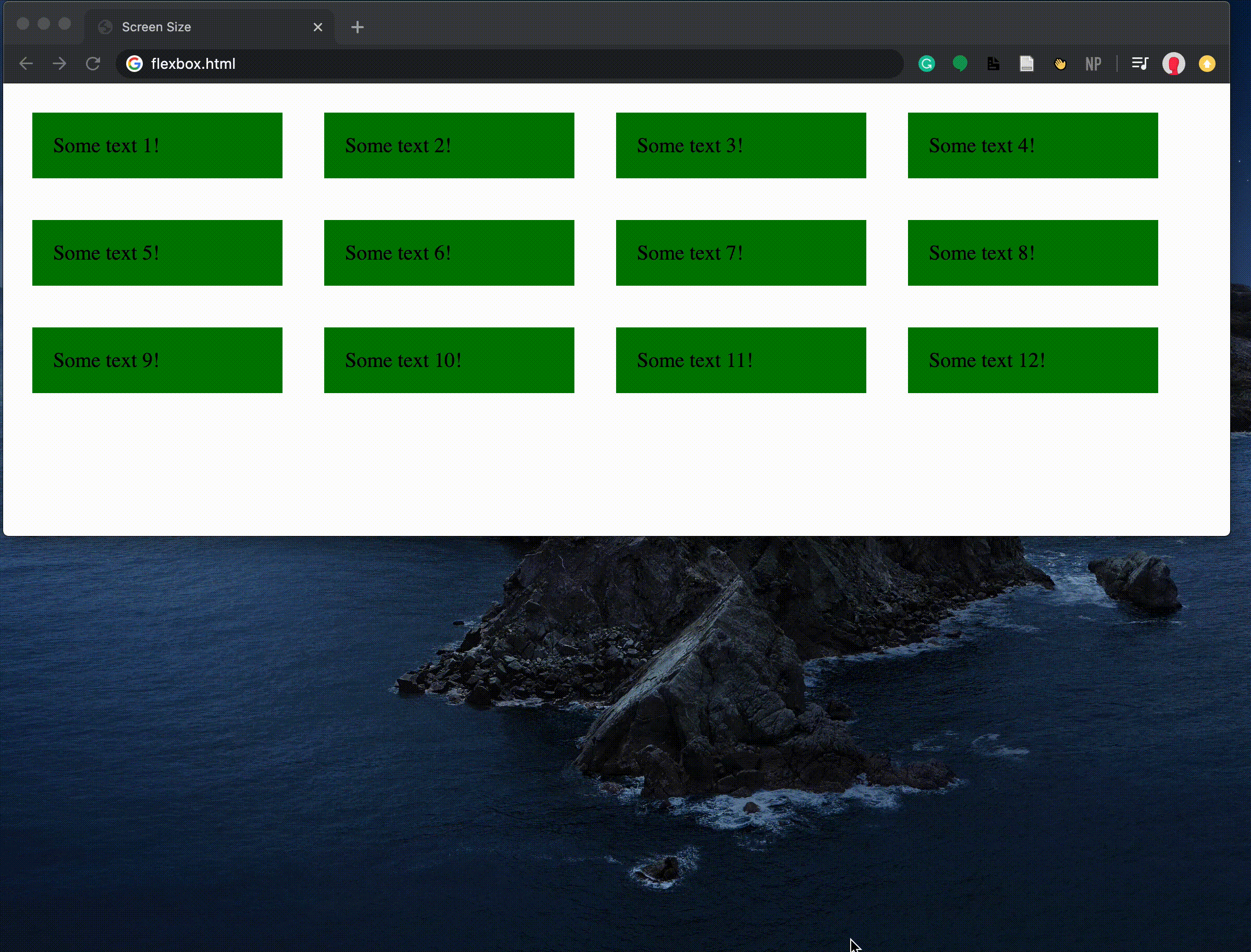
- Another way to deal with differing screen size is using a new CSS attribute known as a flexbox. This allows us to easily have elements wrap around to the next line if they don’t fit horizontally. We do this by putting all of our elements in a
divthat we’ll call our container. We then add some styling to that div specifying that we want to use a flexbox display for the elements inside of it. We’ve also added some additional styling to the inner divs to better illustrate the wrapping that’s occuring here.
<!DOCTYPE html>
<html lang="en">
    <head>
        <title>Screen Size</title>
        <style>
            #container {
                display: flex;
                flex-wrap: wrap;
            }

            #container > div {
                background-color: green;
                font-size: 20px;
                margin: 20px;
                padding: 20px;
                width: 200px;
            }
        </style>
    </head>
    <body>
        <div id="container">
            <div>Some text 1!</div>
            <div>Some text 2!</div>
            <div>Some text 3!</div>
            <div>Some text 4!</div>
            <div>Some text 5!</div>
            <div>Some text 6!</div>
            <div>Some text 7!</div>
            <div>Some text 8!</div>
            <div>Some text 9!</div>
            <div>Some text 10!</div>
            <div>Some text 11!</div>
            <div>Some text 12!</div>
        </div>
    </body>
</html>
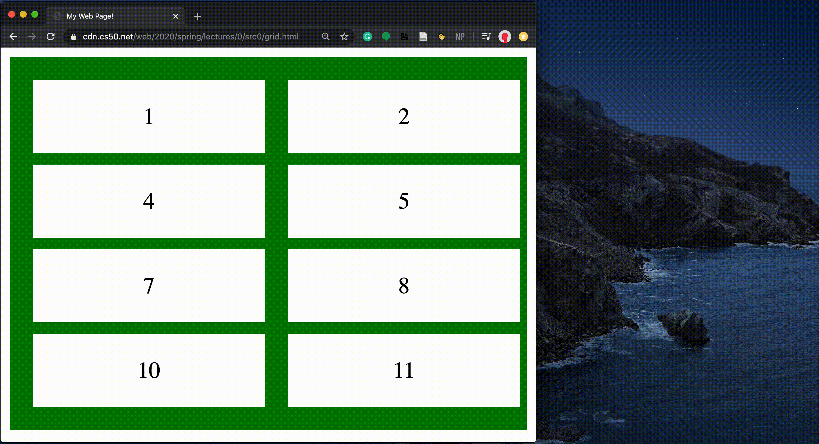
- Another popular way of styling a page is using an HTML grid. In this grid, we can specify style attributes such as column widths and gaps between columns and rows, as demonstrated below. Note that when we specify column widths, we say the third one is
auto, meaning it should fill the rest of the page.
<!DOCTYPE html>
<html lang="en">
    <head>
        <title>My Web Page!</title>
        <meta name="viewport" content="width=device-width, initial-scale=1.0">
        <style>
            .grid {
                background-color: green;
                display: grid;
                padding: 20px;
                grid-column-gap: 20px;
                grid-row-gap: 10px;
                grid-template-columns: 200px 200px auto;
            }

            .grid-item {
                background-color: white;
                font-size: 20px;
                padding: 20px;
                text-align: center;
            }
        </style>
    </head>
    <body>
        <div class="grid">
            <div class="grid-item">1</div>
            <div class="grid-item">2</div>
            <div class="grid-item">3</div>
            <div class="grid-item">4</div>
            <div class="grid-item">5</div>
            <div class="grid-item">6</div>
            <div class="grid-item">7</div>
            <div class="grid-item">8</div>
            <div class="grid-item">9</div>
            <div class="grid-item">10</div>
            <div class="grid-item">11</div>
            <div class="grid-item">12</div>
        </div>
    </body>
</html>
Bootstrap
- It turns out that there are many libraries that other people have already written that can make the styling of a webpage even simpler. One popular library that we’ll use throughout the course is known as bootstrap.
- We can include bootstrap in our code by adding a single line to the head of our HTML file:
<link rel="stylesheet" href="https://stackpath.bootstrapcdn.com/bootstrap/4.5.0/css/bootstrap.min.css" integrity="sha384-9aIt2nRpC12Uk9gS9baDl411NQApFmC26EwAOH8WgZl5MYYxFfc+NcPb1dKGj7Sk" crossorigin="anonymous">
- Next, we can look at some of bootstrap’s features by navigating to the documentation portion of their website. On this page, you’ll find many examples of classes you can add to elements that allow them to be styled with bootstrap.
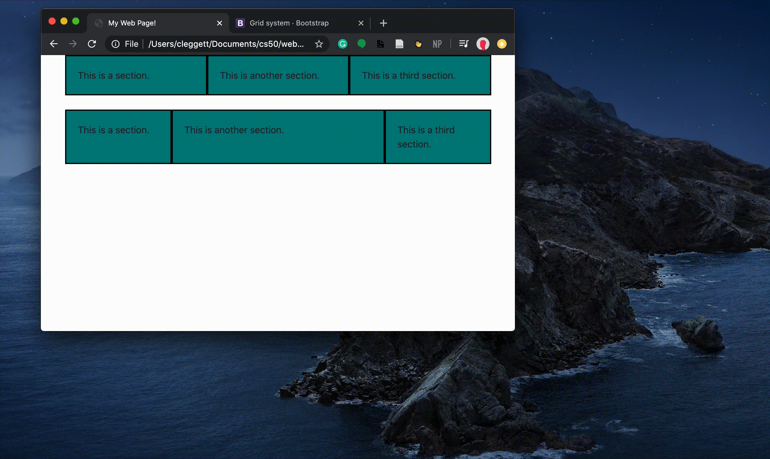
- One popular bootstrap feature is their grid system. Bootstrap automatically splits a page into 12 columns, and we can decide how many columns an element takes up by adding the class
col-xwherexis a number between 1 and 12. For example, in the following page, we have a row of columns of equal width, and then a row where the center column is larger:
<!DOCTYPE html>
<html lang="en">
    <head>
        <title>My Web Page!</title>
        <link rel="stylesheet" href="https://stackpath.bootstrapcdn.com/bootstrap/4.4.1/css/bootstrap.min.css" integrity="sha384-Vkoo8x4CGsO3+Hhxv8T/Q5PaXtkKtu6ug5TOeNV6gBiFeWPGFN9MuhOf23Q9Ifjh" crossorigin="anonymous">
        <style>
            .row > div {
                padding: 20px;
                background-color: teal;
                border: 2px solid black;
            }
        </style>
    </head>
    <body>
        <div class="container">
            <div class="row">
                <div class="col-4">
                    This is a section.
                </div>
                <div class="col-4">
                    This is another section.
                </div>
                <div class="col-4">
                    This is a third section.
                </div>
            </div>
        </div>
        <br/>
        <div class="container">
            <div class="row">
                <div class="col-3">
                    This is a section.
                </div>
                <div class="col-6">
                    This is another section.
                </div>
                <div class="col-3">
                    This is a third section.
                </div>
            </div>
        </div>
    </body>
</html>
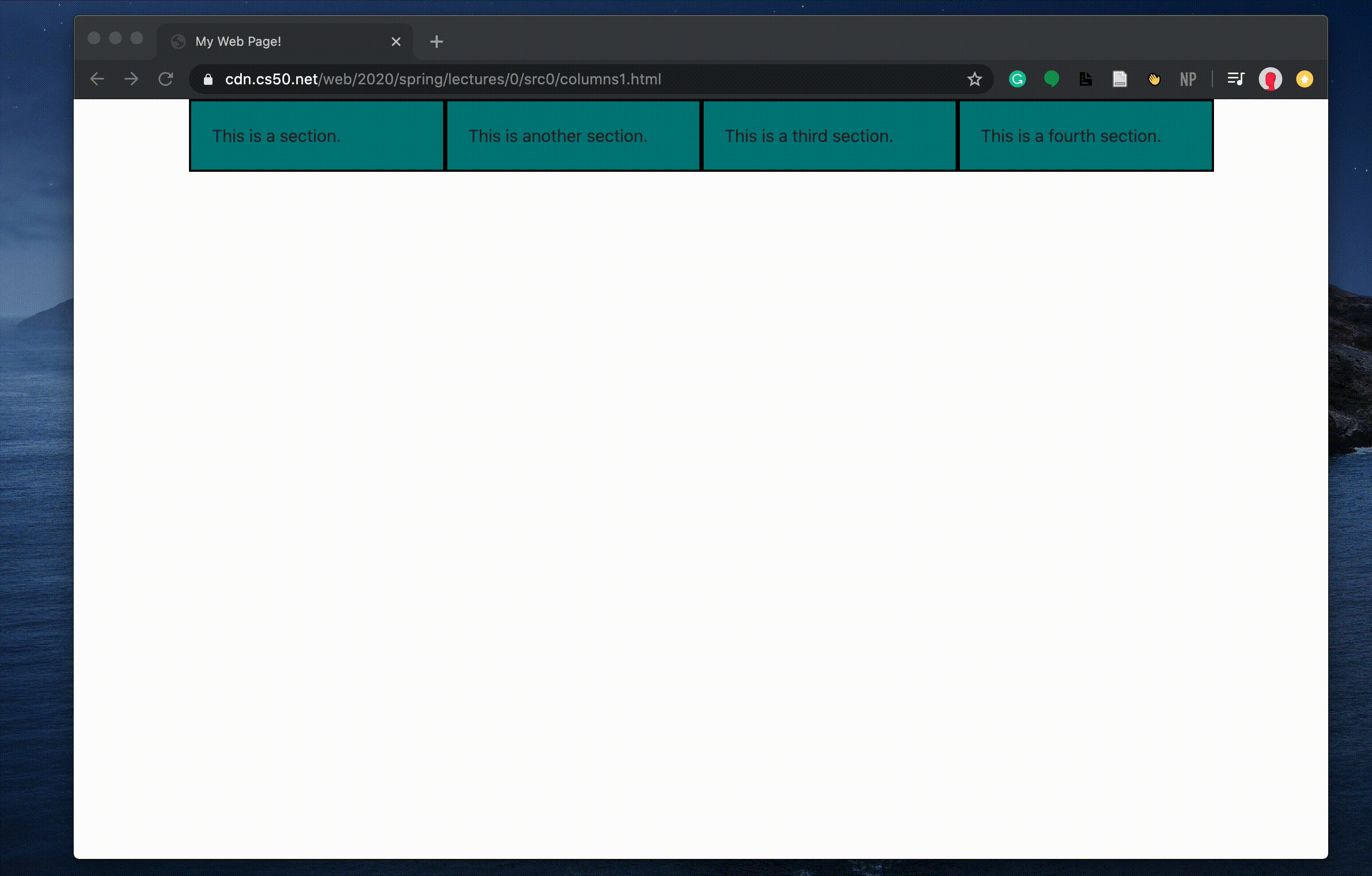
- To improve mobile-responsiveness, bootstrap also allows us to specify column sizes that differ depending on the screen size. In the following example, we use
col-lg-3to show that an element should take up 3 columns on a large screen, andcol-sm-6to show an element should take up 6 columns when the screen is small:
<!DOCTYPE html>
<html lang="en">
    <head>
        <title>My Web Page!</title>
        <link rel="stylesheet" href="https://stackpath.bootstrapcdn.com/bootstrap/4.4.1/css/bootstrap.min.css" integrity="sha384-Vkoo8x4CGsO3+Hhxv8T/Q5PaXtkKtu6ug5TOeNV6gBiFeWPGFN9MuhOf23Q9Ifjh" crossorigin="anonymous">
        <style>
            .row > div {
                padding: 20px;
                background-color: teal;
                border: 2px solid black;
            }
        </style>
    </head>
    <body>
        <div class="container">
            <div class="row">
                <div class="col-lg-3 col-sm-6">
                    This is a section.
                </div>
                <div class="col-lg-3 col-sm-6">
                    This is another section.
                </div>
                <div class="col-lg-3 col-sm-6">
                    This is a third section.
                </div>
                <div class="col-lg-3 col-sm-6">
                    This is a fourth section.
                </div>
            </div>
        </div>
    </body>
</html>
Sass (Syntactically Awesome Style Sheets)
- So far, we’ve found a few ways to eliminate redundancy in CSS such as moving it to separate files or using bootstrap, but there are still quite a few places where we can still make improvements. For example, what if we want several elements to have different styles, but for all of them to be the same color? If we decide later we want to change the color, then we would have to change it within several different elements.
- Sass is a language that allows us to write CSS more efficiently in several ways, one of which is by allowing us to have variables, as in the following example.
- When writing in Sass, we create a new file with the extension
filename.scss. In this file, we can create a new variable by adding a$before a name, then a colon, then a value. For example, we would write$color: redto set the variable color to the value red. We then access that variable using$color. Here’s an example of our variables.scss file:
$color: red;

ul {
    font-size: 14px;
    color: $color;
}

ol {
    font-size: 18px;
    color: $color;
}
- Now, in order to link this styling to our HTML file, we can’t just link to the
.scssfile because most web browsers only recognize.cssfiles. To deal with this problem, we have to download a program called Sass onto our computers. Then, in our terminal, we writesass variables.scss:variables.cssThis command will compile a .scss file namedvariables.scssinto a .css file namedvariables.css, to which you can add a link in your HTML page. - To speed up this process, we can use the command
sass --watch variables.scss:variables.csswhich automatically changes the.cssfile every time a change is detected in the.scssfile. - While using Sass, we can also physically nest our styling rather than use the CSS selectors we talked about earlier. For example, if we want to apply some styling only to paragraphs and unordered lists within a div, we can write the following:
div {
    font-size: 18px;

    p {
        color: blue;
    }

    ul {
        color: green;
    }
}
Once compiled into CSS, we would get a file that looks like:
div {
    font-size: 18px;
}

div p {
    color: blue;
}

div ul {
    color: green;
}
- One more feature that Sass gives us is known as inheritance. This allows us to create a basic set of styling that can be shared by several different elements. We do this by adding a
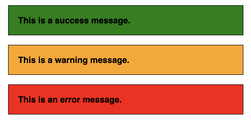
%before a name of a class, adding some styling, and then later adding the line@extend %classnameto the beginning of some styling. For example, the following code applies the styling within themessageclass to each of the different classes below, resulting in a webpage that looks like the one below.
%message {
    font-family: sans-serif;
    font-size: 18px;
    font-weight: bold;
    border: 1px solid black;
    padding: 20px;
    margin: 20px;
}

.success {
    @extend %message;
    background-color: green;
}

.warning {
    @extend %message;
    background-color: orange;
}

.error {
    @extend %message;
    background-color: red;
}
- That wraps up our content for today!